Feature article
Resene's Best Neutral Tones for a Classic and Versatile Home Design
Resene’s top neutral shades offer timeless versatility and style, perfect for any room's design and colour palette.
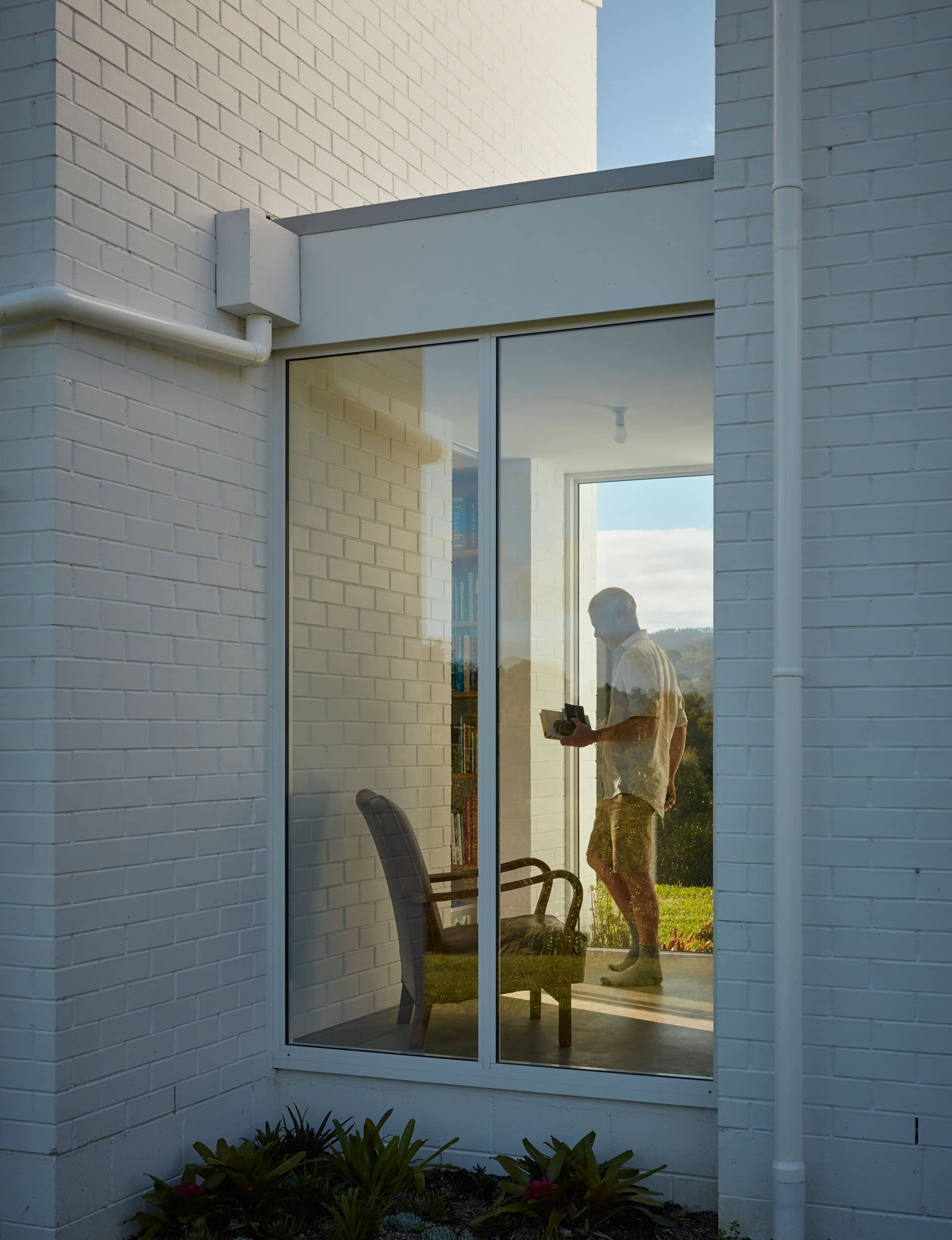
The most versatile of all the neutrals, white tones are intrinsically linked to our sense of ‘home’, featuring in both interior and exterior applications. Image: Sam Hartnett
“But neutrals are so boring!” is the cry of the colour obsessed. Definitely not so. The thing about the quiet neutrals – over the showy colours — is staying power. Neutrals never go out of style and they offer boundless flexibility when it comes to being teamed with other colours.
Now, you may think that neutrals offer very slim pickings, but nothing is further from the truth. Grab your own Resene The Range Whites & Neutrals fan deck and be amazed at the 360 choices spanning the gamut of white to black.
With so much choice, it could be daunting trying to figure out which neutral is right for you. Rest easy, we’ve broken it down for you, and with a wee musical interlude to boot.
A whiter shade of pale...
The reigning champion of neutrals, white is, without doubt the most versatile and most popular colour when it comes to decorating. In fact, of Resene’s top 20 most popular paint colours, 18 of them are various shades of white. With so many options to choose from you may find yourself asking: “Which white is right for me?” The first question to ask is are you looking to warm up a space or to cool it down?
Whites with a yellow base will give you a warming effect and are great for layering neutrals, while those with a blue or green base will impart a sense of crispness that will make other colours ‘pop’. White can also be used in monochromatic schemes that can give your interior tonal depth, not to mention what it can do for your exterior! There’s a reason why a ‘white picket fence’ is the goal when it comes to homeownership, or why we, as Kiwis, gravitate towards white painted weatherboards and other facades — like this home by Crosson Architects.
Paint it black...
While it may seem counterintuitive to say black is a neutral, the fact is, like its counterpart, white, black is a great choice when you want to layer a monochromatic scheme, or you’re looking for a bold offset for other colours.
Layer black with charcoal and/or deep greys for a dramatically powerful statement in a masculine bedroom or bathroom. Or opt for THE classic, and in addition to black bring in several shades of white for an updated look.
Team this with a pop of colour or plenty of natural plants for instant pzazz.
Touch of Grey...
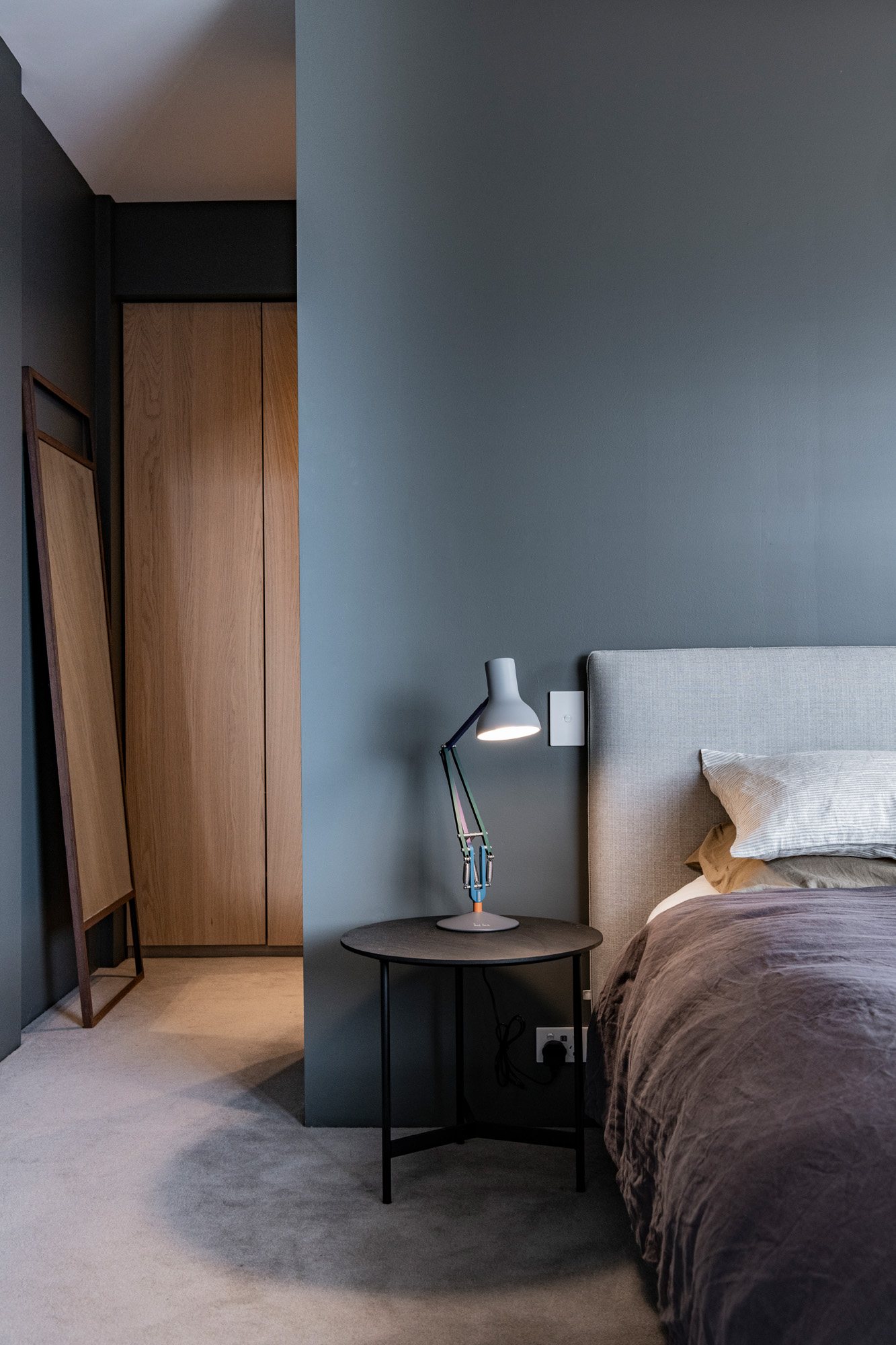
Like white and black, grey is considered to be a ‘pure neutral’ in that it is fully saturated and doesn’t have a base tone. However, by mixing pure neutrals with primary and secondary colours, you can influence the resulting colour’s own saturation and perceived vibrancy; hence we have ‘grey green’ and ‘blueish grey’ — such as can be seen in this master bedroom in a house by architectural designer Case Ornsby.
When you’re looking to accent your grey interior, there are a number of colours that pair well with this pure neutral; green and blue, of course but also red, mustard and pink will add differing levels of flair to your scheme.
The deep tones of the bedroom walls, painted in Resene Gravel, introduce a restful element and elegant juxtaposition to the timber accents. Image: Stephen Goodenough
Yellow submarine...
When we think yellow we tend to think of the vibrant, primary yellow with its sun-like saturation. However, the softer, honey-hued yellows, offer up a sweetly pale that both soothes and relaxes the senses, lending a feeling of tranquillity to any space.
Yellow is a colour that can also handle taking on a darker character. The Victorians loved to ‘muddy’ up their colours and shades of mustard and clay can also serve you well as a neutral base upon which to build your interior scheme — especially if you’re renovating a period home.
Blue Monday...
If white is the king of neutrals, then blue is definitely its queen. One need only to look to nature to appreciate the dizzying array of blue tones across the landscape. Pale blue evokes a time of day when the summer sun has slipped beneath the horizon but there remains enough daylight to stave off the all-too-soon dusk.
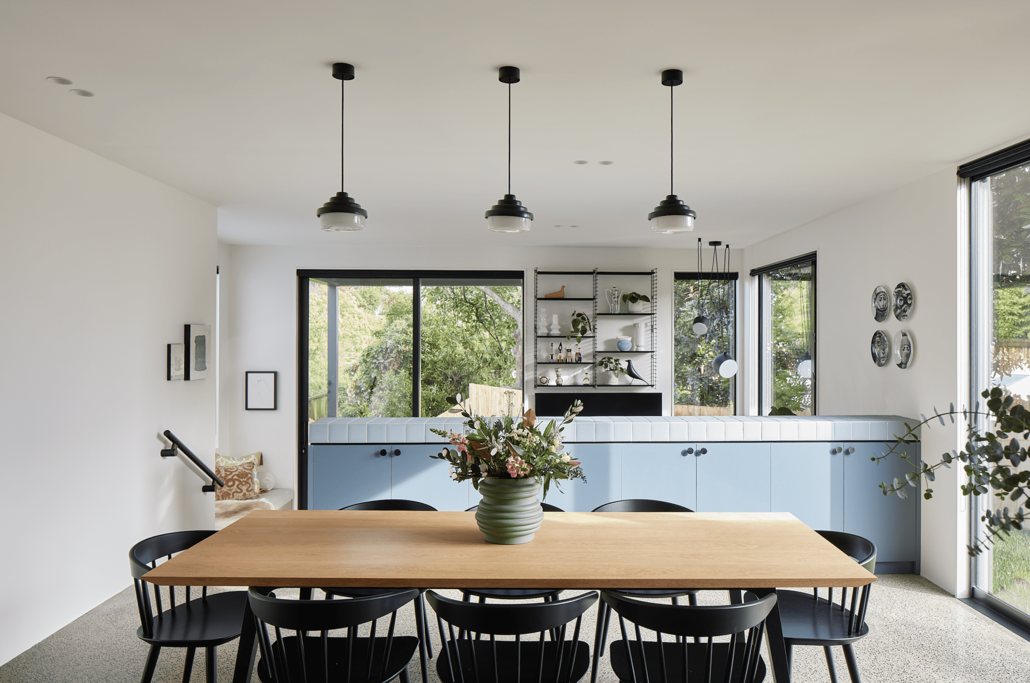
Or perhaps it’s the exact shade of the clearest Caribbean sea, glinting atop the whitest sands you’ve ever seen. Either way, it brings with it a sense of peace that few other colours are able to do. Used as an accent — such as in this home by Rogan Nash Architects — pale blue has the power to anchor an interior design without the need to overpower.
Home Sweet Home by Rogan Nash Architects champions a neutral palette offset by bold patterns and accents. Home Sweet Home was recently announced the Home Magazine 2024 Resene Colour Award winner. Image: Simon Wilson
Pretty in Pink...
While we’re getting our nature on, let us not forget pink — the colour of sunrises and sunsets and of course everyone’s favourite flower, the rose. Once the colour of masculinity, pink has since gone on to denote a soft, femininity with its subtle undertones that marry nicely with emerald green and navy blue.
Pale rose tints have long been teamed with white to create a gentler take on the classic black and white motif, and together provide a subtly rich and layered look that deserves recognition. For a fresh take on pink, choose one with a slightly grey base, as this will team nicely with the aforementioned emerald and navy.
(It ain't easy) Bein' Green...
“But green is the colour of spring…” so goes the song, which is perhaps why it has the ability to elevate our mood as it conjures to mind the possibilities of what could be in a world that is reinventing itself.
Much as plants bring lushness to a space, green hues in all their richness do the same; everything from the softest tone through to the inkiest sage green. The reference to nature cannot be understated, especially in our increasingly urbanised lives where having a sense of connection to the natural environment has been shown to have beneficial health outcomes.
This alone is reason enough to check out the possibilities that green as a neutral — along with all the other neutrals we’ve explored here today — can provide when incorporated into your interior design scheme.
Grab your own copy of Resene’s The Range Whites & Neutrals fan deck for all these colours and more.
Author
Other articles you might like